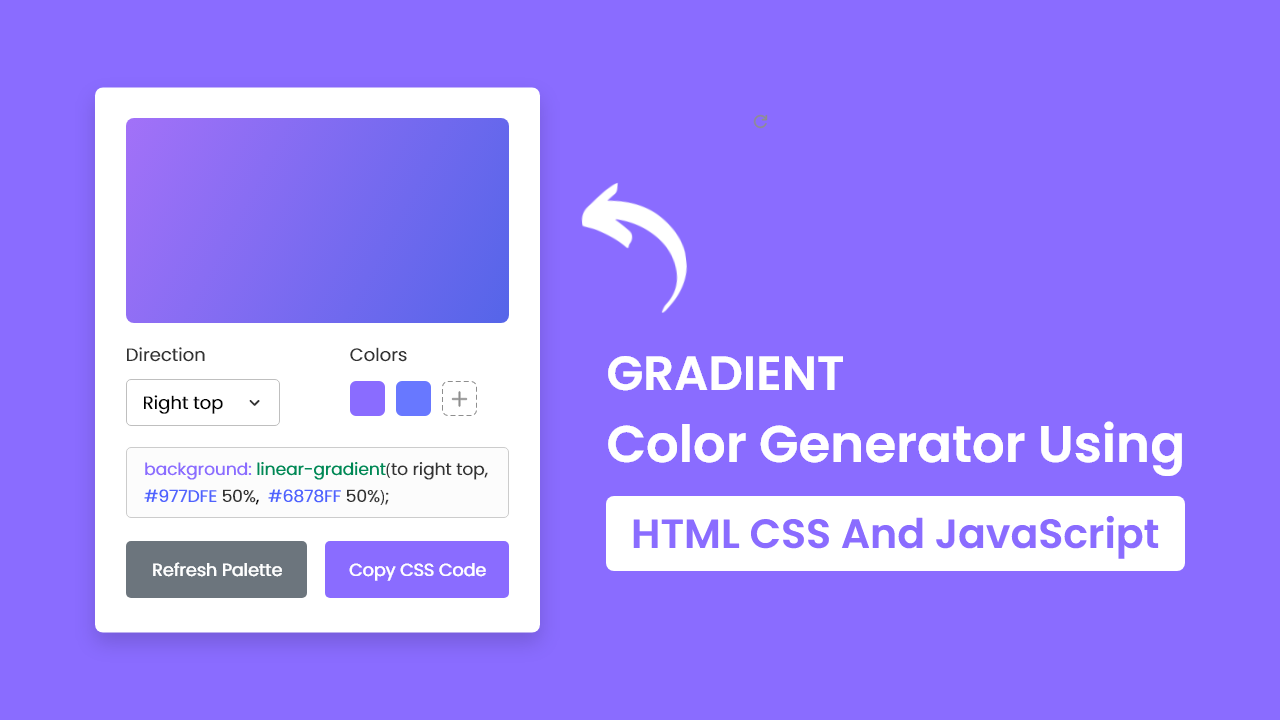
In this blog post, I’ll show the steps for building a gradient color generator using HTML, CSS, and JavaScript. This project is perfect for beginners who want to learn more about web development concepts such as DOM manipulation, event handling, and CSS styling.
In this gradient generator, you can easily create different gradient backgrounds by randomly generating colors or selecting your preferred colors. You can also copy the CSS color code for your generated gradient with a single click.
Steps For Creating Gradient Generator in JavaScript
To create a gradient color generator using HTML, CSS, and JavaScript, follow the given steps line by line:
1. Create a folder. You can name this folder whatever you want, and inside this folder, create the mentioned files.
2. Create an index.html file.
3. Create a style.css file
4. Create a script.js file.
To start, add the following HTML codes to your index.html file to create a basic structure for a gradient color generator.
<!DOCTYPE html>
<!-- Coding By CodingNepal - youtube.com/codingnepal -->
<html lang="en" dir="ltr">
  <head>
    <meta charset="utf-8">
    <title>Gradient Color Generator in JavaScript | CodingNepal</title>
    <link rel="stylesheet" href="style.css">
    <meta name="viewport" content="width=device-width, initial-scale=1.0">
    <script src="script.js" defer></script>
  </head>
  <body>
    <div class="wrapper">
      <div class="gradient-box"></div>
      <div class="row options">
        <div class="column direction">
          <p>Direction</p>
          <div class="select-box">
            <select>
              <option value="to top">Top</option>
              <option value="to right top">Right top</option>
              <option value="to right">Right</option>
              <option value="to right bottom">Right bottom</option>
              <option value="to bottom">Bottom</option>
              <option value="to left bottom">Left bottom</option>
              <option value="to left">Left</option>
              <option value="to left top" selected>Left top</option>
            </select>
          </div>
        </div>
        <div class="column palette">
          <p>Colors</p>
          <div class="colors">
            <input type="color" value="#5665E9">
            <input type="color" value="#A271F8">
          </div>
        </div>
      </div>
      <textarea class="row" disabled>background-image: linear-gradient(to left top, #977DFE,  #6878FF);</textarea>
      <div class="row buttons">
        <button class="refresh">Refresh Colors</button>
        <button class="copy">Copy Code</button>
      </div>
    </div>

  </body>
</html>
Next, add the following CSS codes to your style.css file to style and make the gradient generator visually appealing. If you wish, you can customize it to your liking by changing the color, font, size, and other properties in the file.
/* Import Google font - Poppins */
@import url('https://fonts.googleapis.com/css2?family=Poppins:wght@400;500;600&display=swap');
* {
  margin: 0;
  padding: 0;
  box-sizing: border-box;
  font-family: 'Poppins', sans-serif;
}
body {
  padding: 0 10px;
  display: flex;
  align-items: center;
  justify-content: center;
  min-height: 100vh;
  background: #8A6CFF;
}
.wrapper {
  width: 450px;
  padding: 25px;
  background: #fff;
  border-radius: 7px;
  box-shadow: 0 15px 30px rgba(0,0,0,0.06);
}
.wrapper .gradient-box {
  height: 220px;
  width: 100%;
  border-radius: 7px;
  background: linear-gradient(to left top, #5665E9, #A271F8);
}
.wrapper .row {
  display: flex;
  margin: 20px 0;
  justify-content: space-between;
}
.options p {
  font-size: 1.1rem;
  margin-bottom: 8px;
}
.row :where(.column, button) {
  width: calc(100% / 2 - 12px);
}
.options .select-box {
  border-radius: 5px;
  padding: 10px 15px;
  border: 1px solid #aaa;
}
.select-box select {
  width: 100%;
  border: none;
  outline: none;
  font-size: 1.12rem;
  background: none;
}
.options .palette {
  margin-left: 60px;
}
.palette input {
  height: 41px;
  width: calc(100% / 2 - 20px);
}
.palette input:last-child {
  margin-left: 6px;
}
.wrapper textarea {
  width: 100%;
  color: #333;
  font-size: 1.05rem;
  resize: none;
  padding: 10px 15px;
  border-radius: 5px;
  border: 1px solid #ccc;
}
.buttons button {
  padding: 15px 0;
  border: none;
  outline: none;
  color: #fff;
  margin: 0 0 -15px;
  font-size: 1.09rem;
  border-radius: 5px;
  cursor: pointer;
  transition: 0.3s ease;
}
.buttons .refresh {
  background: #6C757D;
}
.buttons .refresh:hover {
  background: #5f666d;
}
.buttons .copy {
  background: #8A6CFF;
}
.buttons .copy:hover {
  background: #704dff;
}

@media screen and (max-width: 432px) {
  .wrapper {
    padding: 25px 20px;
  }
  .row :where(.column, button) {
    width: calc(100% / 2 - 8px);
  }
  .options .select-box {
    padding: 8px 15px;
  }
  .options .palette  {
    margin-left: 40px;
  }
  .options .colors {
    display: flex;
    justify-content: space-between;
  }
  .palette input {
    width: calc(100% / 2 - 5px);
  }
  .palette input:last-child {
    margin-left: 0;
  }
}
Finally, add the following JavaScript code to your script.js file to add functionality for the gradient generator: To understand the code more deeply, you can watch the above YouTube video tutorial or read the comments within the code and experiment with it.
const gradientBox = document.querySelector(".gradient-box");
const selectMenu = document.querySelector(".select-box select");
const colorInputs = document.querySelectorAll(".colors input");
const textarea = document.querySelector("textarea");
const refreshBtn = document.querySelector(".refresh");
const copyBtn = document.querySelector(".copy");

const getRandomColor = () => {
    // Generating a random color in hexadecimal format. Example: #5665E9
    const randomHex = Math.floor(Math.random() * 0xffffff).toString(16);
    return `#${randomHex}`;
}

const generateGradient = (isRandom) => {
    if(isRandom) { // If isRandom is true, update the colors inputs value with random color
        colorInputs[0].value = getRandomColor();
        colorInputs[1].value = getRandomColor();
    }
    // Creating a gradient string using the select menu value with color input values
    const gradient = `linear-gradient(${selectMenu.value}, ${colorInputs[0].value}, ${colorInputs[1].value})`;
    gradientBox.style.background = gradient;
    textarea.value = `background: ${gradient};`;
}

const copyCode = () => {
    // Copying textarea value and updating the copy button text
    navigator.clipboard.writeText(textarea.value);
    copyBtn.innerText = "Code Copied";
    setTimeout(() => copyBtn.innerText = "Copy Code", 1600);
}

colorInputs.forEach(input => {
    // Calling generateGradient function on each color input clicks
    input.addEventListener("input", () => generateGradient(false));
});

selectMenu.addEventListener("change", () => generateGradient(false));
refreshBtn.addEventListener("click", () => generateGradient(true));
copyBtn.addEventListener("click", copyCode);Conclusion
By following the steps in this blog post, you have successfully built a Gradient Color Generator using HTML, CSS, and JavaScript.